

Commentaire
22


Information
| Section | Natur: Totes |
| Dossier | Meine Bilder |
| Vu de | 1 148 |
| Publiée | |
| Langue |

|
| Licence |
Copier la photo

Insère le lien suivant dans un commentaire, une description ou un message pour montrer cette image.
Copier le lien...
Clique, STP, sur le lien et utilise la combinaison de touches "Ctrl C" [Win] ou "Cmd C" le [Mac] autour du lien à copier.
Partager sur Messenger
Insérez le lien suivant dans le champ de commentaire de la conversation désirée dans Messenger en utilisant 'Coller' pour envoyer cette image dans le message.
Copier le lien...
Clique, STP, sur le lien et utilise la combinaison de touches "Ctrl C" [Win] ou "Cmd C" le [Mac] autour du lien à copier.
Carina Pietsch 24/05/2009 10:22
eine tolle Idee und ein tolles Detail- hier stimmt alles!VolkeR.™ 17/05/2008 23:40
Feine Aufnahme, tolles Bokeh!Wilfried Kühn 14/04/2008 17:01
Sehr schönes Motiv und spitze abgelichtet und präsentiert!!!VG Willy aus Berlin
Roswitha Schleicher-Schwarz 14/04/2008 14:35
Sensible Sichtweise. Sehr gefühlvolle Darstellung.Herzlichst Roswitha
Wolfgang Weninger 14/04/2008 8:17
leicht und locker serviert und sehr gut freigestelltServus, Wolfgang
Günther Weber 11/04/2008 20:02
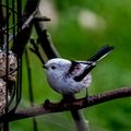
Wenn jemand kurz hintereinander zwei ähnliche Bilder zeigt, dann ist vermutlich eine vergleichende Beurteilung erwünscht. Beide Bilder sind zweifelsfrei sehr gut gestaltet. Mir persönlich sagt aber dieses hier besser zu. Bei dem anderen Bild finde ich die Zweige im Hintergrund leicht störend. Bei diesem hier ist der Hintergrund etwas dunkler, wodurch der Kontrast zur weißen Feder besser zur Geltung kommt. Außerdem gefallen mir hier die Rahmenproportionen besser.LG, Günther
Alexandra Arnold 11/04/2008 16:46
noch besser.Durch den dunkleren HG kommt der Kontrast besser zur geltung. Hat eine schöne Wirkung
lg,Alex
Ulla S. 11/04/2008 9:20
Diese Ausführung gefällt mir noch besser!Zauberhaftes Motiv wundervoll gezeigt.
Ich wünsche Dir ein angenehmes Wochenende,
Ulla
I Anna I I R I 11/04/2008 0:30
diese variante könnte ich mir auch gut in sepia oder sw vorstellen. diese aufnahme gefällt mir auch sehr gut. lg.Sönke Behrens 10/04/2008 23:26
Ich denke diese Variante ist dir ein Tick besser gelungen.LG
Sönke
Angela J. 10/04/2008 22:45
Ein Bild zum längeren Betrachten. Sehr schön.LG Angela
klasarus 10/04/2008 20:34
Die etwas dunklere, kontrastreichere Variante ist sicherlich noch einen Ticken aussagefähiger.LG Klaus
J-La 10/04/2008 18:44
Stark, wieder eine tolle Aufnahme.Gruß Jürgen
Winkelsucher 10/04/2008 16:54
Ich persönlich finde das von den beiden am besten. Wirkt sehr intensiv!LG, @rmin
Bärbel7 10/04/2008 16:50
Freistellung vorm Hintergrund ist besser, die Schärfe auch und das Weiß nicht überstrahlt - richtig fein! Gruß Bärbel