

Commentaire
15


Information
| Section | Subjects: Architecture |
| Vu de | 3 384 |
| Publiée | |
| Langue |

|
| Licence |
Copier la photo
Insère le lien suivant dans un commentaire, une description ou un message pour montrer cette image.
Copier le lien...
Clique, STP, sur le lien et utilise la combinaison de touches "Ctrl C" [Win] ou "Cmd C" le [Mac] autour du lien à copier.
Partager sur Messenger
Insérez le lien suivant dans le champ de commentaire de la conversation désirée dans Messenger en utilisant 'Coller' pour envoyer cette image dans le message.
Copier le lien...
Clique, STP, sur le lien et utilise la combinaison de touches "Ctrl C" [Win] ou "Cmd C" le [Mac] autour du lien à copier.
Detlef Klahm 04/02/2006 16:00
is a bridge deck ever horizontal?Andrew Denissov 13/09/2005 16:19
i like itPetra Finkenzeller 13/09/2005 9:32 Commentaire de vote
i think it's idea to shoot from the perspective you've gone for, but i agree with wovo that the lines would look much better either totally horizontal or totally not horizontal. Sorry, contra, even though i do like the idea as such.Angel Pena 13/09/2005 9:32 Commentaire de vote
proSiegfried Hansen 13/09/2005 9:32 Commentaire de vote
a good viewpro
When 13/09/2005 9:32 Commentaire de vote
I think that it not being horizontal was made it more special to me. I would find it boring if it had been shot that way. I don't see the lack of sharpness. Could someone explain? It's very interesting to me how all the lines converge at the "jump off" point. Almost like a matrix. I see it as if I can almost walk down it like a sidewalk into nothingness.Danny W. Wilson 13/09/2005 9:32 Commentaire de vote
Maybe if reshot with WOVO and Kay's advice, but as is, I just can't.....sorryKay Wölfle 13/09/2005 9:32 Commentaire de vote
The colours and the abstract look about it great. But I have to agree with wovo that the overall composition lacks a clearly defined concept. contra+ ;-)Greetings Kay
† wovo 13/09/2005 9:32 Commentaire de vote
I've some problems here:1. I thinks it lacks some sharpness.
2. the lines should be horicontal - or even more out of the horizonal.
sorry contra
wovo
When 13/09/2005 9:32 Commentaire de vote
There are just a lot of reasons that I wanted to propose this to the gallery. I really love abstracts and I think they are under represented. I think this one is really breath taking. First I love the vibrant colors, then the compostion and depth, the execution of perspective and presentation. I find it eye teasing and interesting. I hope others find it as inspiring.Detlef Klahm 03/09/2005 1:59
Thanks Wen P. You have made my day today with your delightful praises!When 02/09/2005 8:22
Wow, what composition! Color, depth. You have such a varied portfolio - but it's really the abstracts that take me away.Detlef Klahm 23/08/2005 15:37
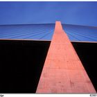
Hi Anastasya! Thank You for commenting on my imges!The centre, diagonal, part is a column, looking straight up, the horizontal part is the bridge deck, cables are the rest of the image.
take care!...detlef
Anastasiya Ivanova 23/08/2005 5:53
very creative, the outline and arrangement do really good this one. However I am wondering which part of it is the bridge...The broad one at the center?anastasia
PINDORIUS 24/07/2005 9:58
special composition. I like the lines.