

Commentaire
12


Information
| Section | Natur: Äcker, Felder & Wiesen |
| Dossier | uploads |
| Vu de | 555 |
| Publiée | |
| Langue |

|
| Licence |

|
Plébiscité par

Partager sur Messenger
Insérez le lien suivant dans le champ de commentaire de la conversation désirée dans Messenger en utilisant 'Coller' pour envoyer cette image dans le message.
Copier le lien...
Clique, STP, sur le lien et utilise la combinaison de touches "Ctrl C" [Win] ou "Cmd C" le [Mac] autour du lien à copier.
Weserkind 04/03/2015 16:56
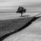
Habe die farbige Variante nicht gesehen aber ich finde das in s/w ziemlich cool. Die Perspektive, die etwas trostlose Stimmung gefällt mir - passt zum einsamen Baum :)Vera Kulow 26/09/2007 17:43
Nun ich tendiere auch zur Farbe, sieht freundlicher aus.Beide Fotos sind auf ihre Art schön und interessant.LG
Vera
Pia Pohl 24/09/2007 22:51
nöööööööö... erich, in farbe ist's viel spannenderhg pia
Micki 24/09/2007 15:58
Diese Variante ist mir persönlich lieber als die bunte.Hier kommt die Dynamik des Bildes besser zur Geltung.
LG Micki
Marina Luise 23/09/2007 20:44
Code: Schwarz-weiss! :-)Petra Sommerlad 23/09/2007 20:32
Kommt auch in s/w gut. Hier weniger die Betonung auf Herbst als vielmehr auf der graphischen Siete. LG PEtraPhotosphäre 23/09/2007 19:52
ich mag das SW lieber. es ist so schön melancholisch, die sich kreuzenden Wege und der Baumschatten sind deutlicher zu erkennen- eine Bildwirkung, die magisch ist.LGT
Lucia H 23/09/2007 19:26
also in farbe ist das foto lebhaft in seiner aussagekraft wogegen s/w naja für mich zu stumpf ich bevorzuge in diesem fall das farbbild!! lg luciaTina.Fuchs 23/09/2007 16:24
das Bild gefällt mir auch, durch das S/W verliert es zwar die Bezeichnung Herbst, aber ein Baumtitel würde gut dazu passen.LG Tina
C. Dietl 23/09/2007 11:52
Auch nicht schlecht, aber in s / w hat das Bild eine völlig andere Wirkung - fast ein bißchen trostlos - und löst damit eine eher traurige Stimmung aus.Die warmen harmonischen Farben dagen erzeugen eine angenehme behagliche Stimmung. Ein eindrucksvolles Beispiel dafür, wie man durch Entfernung der Farbe die Bildwirkung komplett verändern kann !
LG, Claudia
E-Punkt 23/09/2007 9:29
schließe mich den beiden vor mir an.nicht schlecht, aber das Farbfoto
ist wirklich auch für mich das schönere.
Lg. Elfi
____________________________________
Susanne Dhonau 23/09/2007 9:26
In s/w nicht schlecht, aber in bunt ist es wesentlich schöner!LG Susanne