

Commentaire
29


Information
| Section | Spezial: Color Fine Art |
| Dossier | BERLIN |
| Vu de | 1 800 |
| Publiée | |
| Langue |

|
| Licence |
Plébiscité par

Favoris publics

Copier la photo
Insère le lien suivant dans un commentaire, une description ou un message pour montrer cette image.
Copier le lien...
Clique, STP, sur le lien et utilise la combinaison de touches "Ctrl C" [Win] ou "Cmd C" le [Mac] autour du lien à copier.
Partager sur Messenger
Insérez le lien suivant dans le champ de commentaire de la conversation désirée dans Messenger en utilisant 'Coller' pour envoyer cette image dans le message.
Copier le lien...
Clique, STP, sur le lien et utilise la combinaison de touches "Ctrl C" [Win] ou "Cmd C" le [Mac] autour du lien à copier.
motorhand 31/01/2015 18:26
Sehr schönes Licht und elegante Raumwirkung !luccini 27/09/2013 16:23
!!DEAN chimm 19/09/2013 9:16
die farbliche umsetzung,lg.d.CHIMM
Hubert Haase 25/08/2013 20:11
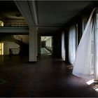
Eine reine Sachaufnahme mit übersrtrahltem Lichtfleck am Bildrand.P r i s m a 18/08/2013 22:07
das Hotel New Hampshire, war sofort mein ersterGedanke... bleib weg von offenen Fenstern :-))
John Irving läßt grüßen
viele liebe Grüße Marianne
Thomas Thomitzek 14/08/2013 23:10
Auch in Farbe stark!LG Thomas
Rainer Golembiewski 13/08/2013 22:28
der Kick ist der Vorhang.......klasse, klasse!André Reinders 13/08/2013 22:24
Toller Aufbau/Blickwinkel und ein klasse Licht!!!VLG
André
Manfred Wenzel 13/08/2013 20:09
...also diese Farben wollte ich hier nicht missen - fein ist das !lg
Manfred
shakeapic 13/08/2013 19:55
zum glück nicht mitternacht :))lg shakeapic
Anette Z. 13/08/2013 19:49
Finde ich klasse. Der Raum wirkt so streng geometrisch. Eigentlich ganz einfach und doch so verwinkelt. Und die wehenden Vorhänge bringen ein verspieltes Element rein. Dazu passt das Licht prima, dass sich auch noch in den Fenstern bis ganz nach hinten den Gang lang fortsetzt.Gruß, Fotomama
Klaus-Günter Albrecht 13/08/2013 19:45
Das ist auch in Farbe schön, aber Claudy hat Recht, in SW wirkt es einfach harmonischer.Liebe Grüße Klaus
Reiner BS 13/08/2013 19:39
Ich mag’s lieber in Farbe.Sehr gut mit dem Licht.
Gefällt.
Gruß Reiner
Petra K... 13/08/2013 19:16
Ich mag warme Herbstfarben ... deshalb lieber dieses!LG Petra
Annemarie Quurck 13/08/2013 18:50
farbig auch nicht schlechtnur in SW wird es konkreter
lg annemarie