")
Commentaire
22


Information
| Sections | Motive: Fassaden Motive: architektonische Details Motive: Orange |
| Dossier | Architektur |
| Vu de | 5 979 |
| Publiée | |
| Langue |

|
| Licence |
Plébiscité par


Copier la photo
Insère le lien suivant dans un commentaire, une description ou un message pour montrer cette image.
Copier le lien...
Clique, STP, sur le lien et utilise la combinaison de touches "Ctrl C" [Win] ou "Cmd C" le [Mac] autour du lien à copier.
Partager sur Messenger
Insérez le lien suivant dans le champ de commentaire de la conversation désirée dans Messenger en utilisant 'Coller' pour envoyer cette image dans le message.
Copier le lien...
Clique, STP, sur le lien et utilise la combinaison de touches "Ctrl C" [Win] ou "Cmd C" le [Mac] autour du lien à copier.
ALLWO 25/06/2024 16:54
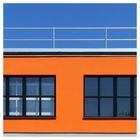
Im unmittelbaren Vergelich .. würde auch ich mich für die erste Version entscheidendie erscheint ( mir ) fotografisch doch noch etwas interessanter - Gruß Wolfgang
manniw1 11/02/2024 22:36
Harmonischer Farbkontrast, durch gelungenen Bildaufbau gut in Szene gesetzt!Gruß Manni
Torsten Hartmann Photography 30/11/2023 20:52
Der Farbkontrast von Blau und Orange wirkt hier spitze! Sehr schön.Monsieur M 26/11/2023 15:27
Nicht schlecht, aber die erste Version gefiel mir besser.LG Norbert
Heike J 24/11/2023 12:09
klasse Foto mit einem guten BildschnittLady Durchblick 16/11/2023 21:20
diese Version find ich besser....klasse
LG Ingrid
Hibbie 16/11/2023 18:28
Eigentlich steht das quadratische Format für Harmonie. Allzu harmonische Bilder wirken allerdins oft sehr langweilig. Das steht hier nicht zu befürchten. Ursachen hierfür sind die wegen ihrer Helligkeit optisch recht dominante Spiegelung im linken Fenster sowie das asymmetrisch angeordnete Geländer auf dem Dach. Der Farbkontrast ist klasse. :-)Ruth U. 14/11/2023 16:45
Eigentlich gefällt mir diese Version noch besser, hier ist nichts was ablenkt von dem klaren Motiv, auch die quadratische Gestaltung gefällt mir sehr.LG Ruth
Jens Demuth 14/11/2023 15:51
Grafisch schön.Grüße, Jens
Peter H. Braun 14/11/2023 14:55
Wo ich jetzt dieses Bild sehe, merke ich, dass mir auf dem vorigen zu viel drauf ist... Ein klare Sache! So mag ich das!Isy H. 13/11/2023 21:53
Was ich so als Laie beurteilen kann, sieht sehr gut ausgerichtet aus. Auch die Farben gefallen mir! Vg IsyEstebanS 13/11/2023 19:00
Ich dachte erst, dass Du jetzt doch gestempelt hast, aber es sieht nach einem anderen Ausschnitt aus. Auch klasse - bestens mit dem Farbkontrast und den Linien und (rechteckigen) Formen.LG, Stefan
Werner Buschette 13/11/2023 18:45
Spektakulär ins Quadrat gesetzt !LG Werner
Olaf D. Hennig 13/11/2023 18:32
Für mein Empfinden fehlen bei dieser auch sehr sehenswerten Version die "belebenden Accessoires" Dachrinne, Lampen und kleinen Unregelmäßigkeiten. Ich gebe Version 1 den Vorzug.Gruß Olaf
aposab1958 13/11/2023 18:14
die Version II gefällt mir auf jeden fall besserdas quadratische Format ist besser
witzig links im fenster noch das weitere Fensterkreuz in Weiß plus noch Schattenwurf- das kommt besser raus
Lg Sabine