

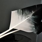
federleicht
Rauschende Feder..
Commentaire
13


Information
| Section | Motive: Alltagsdesign |
| Vu de | 899 |
| Publiée | |
| Langue |

|
| Licence |
Exif
| APN | FinePix HS10 HS11 |
| Objectif | --- |
| Ouverture | 4.5 |
| Temps de pose | 1/38 |
| Focale | 24.9 mm |
| ISO | 800 |
Copier la photo
Insère le lien suivant dans un commentaire, une description ou un message pour montrer cette image.
Copier le lien...
Clique, STP, sur le lien et utilise la combinaison de touches "Ctrl C" [Win] ou "Cmd C" le [Mac] autour du lien à copier.
Partager sur Messenger
Insérez le lien suivant dans le champ de commentaire de la conversation désirée dans Messenger en utilisant 'Coller' pour envoyer cette image dans le message.
Copier le lien...
Clique, STP, sur le lien et utilise la combinaison de touches "Ctrl C" [Win] ou "Cmd C" le [Mac] autour du lien à copier.
Christian Rocher 09/03/2011 6:00
Superbe NB et graphismeBise Brigitte
Belle journée
Axel Hilger 07/03/2011 21:44
Deine grosse Leidenschaft ist die s/w Fotografie ;-)Klasse, muss auch sagen das Rauschen passt zum Bild.
Schönen Abend
LG
Axel
Sindbad48 06/03/2011 20:33
...hättest Du das Rauschen nicht zu Anbeginn selbst erwähnt, hätte es so mancher Betrachter nicht als solches angesehen, sondern die Grobkörnigkeit des Hintergrundes als bewußt gewähltes Stilmittel gewertet,...weil`s hier einfach perfekt zum Motiv passt.Ich find`s toll !
*LG, Frank*
Margot Bäsler 06/03/2011 18:11
Mir gefällt's.---LG Margot---
Schöning Eva 06/03/2011 16:59
Sehr edle Federn wunderbar präsentiert+++LG Eva
Wmr Wolfgang Müller 06/03/2011 13:39
mmmmh......kommt mir alles so verrauscht rüber....sorrywolfgang
Joachim Trettin 06/03/2011 9:58
In diesem Fall passt die Körnung! Kontaste wirken gut!LG
Joh Johns
Ellen-OW 06/03/2011 9:57
Ich finde auch, dass das Rauschen zu diesem Bild passt. Es gibt für Bildbearbeitungsprogramme sogar extra Rauschfilter. Geniales ungewöhnliches Bild.LG Ellen
Ralf J. Diemb 05/03/2011 23:51
Rauschen als Stilmittel ... geht doch ;-)LG Ralf
Claudia Paetz 05/03/2011 22:52
... :-)))... manchmal denke ich aber, die Körnung ist bewusst so gewählt, weil sie hervorragend passt ... so wie hier ...
Dein feines lichtverwöhntes Motiv kommt klasse zur Geltung vor der groben HG-Struktur ... :-)
LG
Claudia
Günter Pilger 05/03/2011 22:26
Ein offenbar bewusst gewählter, weil doppelsinniger Untertitel :-)Ein außergewöhnliches Motiv!
LG Günter
andre.as.pekte 05/03/2011 22:14
... eine Feder soll rauschen, oder? LG, AndreasBrigitte H... 05/03/2011 21:58
@ Claudi ,ich weiß es rauscht. Ich bessere mich ,versprochen..LG Brigitte