

Commentaire
9


Information
| Section | Spezial: Ästhetik der Sichtbarkeit |
| Dossier | Abstraktionen |
| Vu de | 1 060 |
| Publiée | |
| Langue |

|
| Licence |
Favoris publics

Copier la photo
Insère le lien suivant dans un commentaire, une description ou un message pour montrer cette image.
Copier le lien...
Clique, STP, sur le lien et utilise la combinaison de touches "Ctrl C" [Win] ou "Cmd C" le [Mac] autour du lien à copier.
Partager sur Messenger
Insérez le lien suivant dans le champ de commentaire de la conversation désirée dans Messenger en utilisant 'Coller' pour envoyer cette image dans le message.
Copier le lien...
Clique, STP, sur le lien et utilise la combinaison de touches "Ctrl C" [Win] ou "Cmd C" le [Mac] autour du lien à copier.
Gabriele Sieg-Ewe 02/09/2010 11:14
Ich finde schon, dass Dir das gelungen ist und das soll jetzt kein billiger Trost sein!† Günter Suppé 30/08/2010 17:38
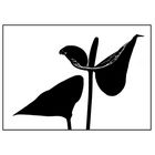
@mf, im Prinzip: Ja,aber die S/W-Vergitterung im Blatt oben rechts
soll hier nicht die llusion einer dritten Dimension
bewirken, sondern der gegebenen Grundspannung
von Schwarz und Weiß ein akzentuierendes Zentrum
hinzufügen, das die Aufmerksamkeit des Betrachters
auf sich ziehen soll. Außerdem wollte ich damit eine
formale Spannung zwischen den beiden Blättern
erzeugen.
Es scheint so, als ob mir das nicht wirklich gelungen
wäre. :-(
Gruß, Günter
eMM-eFF 30/08/2010 15:51
Dann sollte aber gar keine Struktur mehr vorhanden sein. Ent oder weder ;-)Gruß
mf
† Günter Suppé 30/08/2010 10:08
@mf: Der Raum-Eindruck war nicht das Ziel.Hier ging es vielmehr ums Profil.
Denn wenn das Blatt Strukturen hätte,
Wär's eben keine Silhouette.
Gruß, Günter
Yshild 29/08/2010 22:37
Puristisch elegant und fein ausgewogen.eMM-eFF 29/08/2010 21:41
Für meinen Geschmack fehlt es in den schwarzen Flächen / Blütenblättern an Struktur. Der räumliche Eindruck geht leider verloren.Gruß
mf
B.K-K 29/08/2010 20:57
die Blume ist offen und empfängt ... das vermittelt sich mir auch im Schatteniß - eine feine Grafik - :-)LG Brigitte
va bene 29/08/2010 20:14
Sehr gediegenGrüße V.
Gabriele Sieg-Ewe 29/08/2010 19:41
Sehr feine, grafische Arbeit, die auch durch den diagonalen Aufbau besticht!Zuerst habe ich gedacht, dass es schöner gewesen wäre, wenn das linke Anthurienblatt auch ein wenig Struktur aufweisen würde, aber nach längerer Betrachtung bin ich zu dem Schluss gekommen, dass ein eindeutiger Blickpunkt, wie hier, wohl doch besser ist.
Lieben Gruß
Gabi