

Commentaire
14


Information
| Section | Spezial: Monochrome Fine Art |
| Dossier | Nah |
| Vu de | 935 |
| Publiée | |
| Langue |

|
| Licence |
Copier la photo
Insère le lien suivant dans un commentaire, une description ou un message pour montrer cette image.
Copier le lien...
Clique, STP, sur le lien et utilise la combinaison de touches "Ctrl C" [Win] ou "Cmd C" le [Mac] autour du lien à copier.
Partager sur Messenger
Insérez le lien suivant dans le champ de commentaire de la conversation désirée dans Messenger en utilisant 'Coller' pour envoyer cette image dans le message.
Copier le lien...
Clique, STP, sur le lien et utilise la combinaison de touches "Ctrl C" [Win] ou "Cmd C" le [Mac] autour du lien à copier.
~zed~ 04/05/2004 8:29
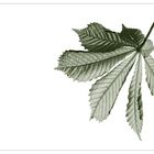
*hach*, das wär mir ja fast entgangen!schicke Tonung!
lg Heike:o)
No. Name. 23/04/2004 18:10
kommt sehr gut ! minimalistisch fein :-)lg nn
Wolfgang Jäckle 22/04/2004 22:16
Das farbige Foto gefällt mir besser!Wolfgang
Mara T. 22/04/2004 18:59
Schöne Pflanzengrafik. Auch das andere in Grün gefällt mir.LG Mara
Kai Aust 22/04/2004 17:44
Das hast du sehr gut dargestellt. Spontan würde ich sagen, dass mich das Blättchen nicht unbedingt stört.mfg kai
Armin Winter 22/04/2004 16:27
Ja, es ist eine Form in Licht. Es hat eine hohe Leuchtkraft. Schöne Transparenz in dem Blatt, und dennoch sehr gut die Struktur und Details wiedergegeben. Klasse Bild. Obwohl ich selbst auch lieber sw mag, spricht mich hier die Farbversion noch mehr an.Gruß, Armin
Rainer Switala 22/04/2004 15:37
also mein favorit ist die farbvarianteauch dieses hier wirkt gut auf mich
gruß rainer
Wiltrud Doerk 22/04/2004 15:16
Wirkt sehr zart und fein --- gefällt mir besser als die Farbvariante! LG von WiltrudThorsten NetsrohT 22/04/2004 12:18
Fragil, zerbrechlich, durchleuchtet bis auf die Knochen. Ja hat was.lg Thorsten
die Maike 22/04/2004 10:10
Ui, ist DAS gut!!Ja, in meinen Augen perfekt, genau so wie es ist.
Klasse.
Lydia S. 22/04/2004 9:47
Mir gefällt es durch die Einfachheit und doch ist das Blatt ein Wunderwerk der Natur - das kleine Blatt oben stört mich auch - für den Schatten am rechten Blatt fehlt durch die Freistellung etwas der Zusammenhang... das ist aber meine bescheidene Meinung - ich muss es erst besser hinkriegen ;-))))l.g.
Lydia
Dalli Klick 22/04/2004 9:15
von der schlichtheit und aufbau sind beide gleich gut. dieses hier spricht mich persönlich mehr an. das kleine blatt oben in der ecke stört jedoch ein wenig.gruss,
olli
Der Dicke 22/04/2004 8:55
feine fotokunst. da haste recht. gefällt!gruß JL
Peter Caspers 22/04/2004 8:48
minimalistisch und grafisch... gefällt mir gut :-)grüße peter