")

Hamburger DOM (2)
Commentaire
10


Information
| Section | Voyage: Hamburg |
| Vu de | 1 666 |
| Publiée | |
| Langue |

|
| Licence |
Copier la photo
Insère le lien suivant dans un commentaire, une description ou un message pour montrer cette image.
Copier le lien...
Clique, STP, sur le lien et utilise la combinaison de touches "Ctrl C" [Win] ou "Cmd C" le [Mac] autour du lien à copier.
Partager sur Messenger
Insérez le lien suivant dans le champ de commentaire de la conversation désirée dans Messenger en utilisant 'Coller' pour envoyer cette image dans le message.
Copier le lien...
Clique, STP, sur le lien et utilise la combinaison de touches "Ctrl C" [Win] ou "Cmd C" le [Mac] autour du lien à copier.
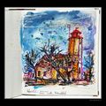
Holger Bürgel 04/12/2003 20:29
Das Foto begeistert mich durch die wunderschönen Farben.LG Holger
Otakar Seycek 03/12/2003 21:14
wieder die note 10,0 von mir!gruss
ota
Uli Benke 03/12/2003 17:47
...super bild. Und das querformat finde ich ich auch ok. ...gruß uliTraude B. 03/12/2003 14:50
ich bin zwar auch ein freund von ton in ton kompositionen bei bild und rahmen aber gerade in diesem fall finde ich den kräftig-blauen rahmen passend!ein himmelblauer rahmen würde neben dem eindrucksvollen bild richtig absaufen!
was die schrift betrifft stimme ich zu, die könnte man weglassen und den titel einfach nur in der bildbeschreibung unterbringen.
Monika Bartosch 03/12/2003 14:00
Kompliment!!! Große Klasse!Ich stimme den Rahmengegnern hier zu, d.h. Rahmen ist schon OK, aber nicht dieses neonblau und Schriftzug muß auch nicht sein und wenn, etwas dezenter und vielleicht eher rechtsbündig - im Gegensatz zu dem links ausgerichteten Bild.
Ist aber alles nicht wirklich wichtig... das Foto ist einfach gelungen!
Hartmut Podeyn 03/12/2003 12:55
wirklich klasse - wie ich sehe, habe ich noch viel zu lernenGruß Hartmut
Traude B. 03/12/2003 10:56
boa! da wird mir schwindlig *gg*aber das bild ist einfach grossartig!
lg
traude
Bernd R 03/12/2003 10:51
Tolles Motiv mit ebensolcher Umsetzung.Manu K. 03/12/2003 10:44
Uiii, das ist guut!Der blaue Rahmen passt mir nicht so ganz optimal dazu ...
Grüsse
Manu :-)