")

Commentaire
20


Information
| Section | Natur: Natur Fine Art |
| Dossier | Flowers |
| Vu de | 1 797 |
| Publiée | |
| Langue |

|
| Licence |
Copier la photo
Insère le lien suivant dans un commentaire, une description ou un message pour montrer cette image.
Copier le lien...
Clique, STP, sur le lien et utilise la combinaison de touches "Ctrl C" [Win] ou "Cmd C" le [Mac] autour du lien à copier.
Partager sur Messenger
Insérez le lien suivant dans le champ de commentaire de la conversation désirée dans Messenger en utilisant 'Coller' pour envoyer cette image dans le message.
Copier le lien...
Clique, STP, sur le lien et utilise la combinaison de touches "Ctrl C" [Win] ou "Cmd C" le [Mac] autour du lien à copier.
bernardo braccini 28/03/2008 7:50
Grossartig .Besonders schön.
Ciao Bernardo
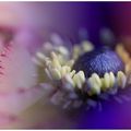
035 ANEMONE FIOR DI STELLA
bernardo bracciniKarinP 27/03/2008 20:56
einfach nur KLASSE!!Farbgebung und Schnitt top, Schärfebereich genau richtig, bin begeistert!
LG Karin
Dr.Hase 26/03/2008 9:39
mit dem schwarzen hintergrund kommts eher nach meinem geschmack, passt eher zum wilden und wiederborstigen von dem kraut, jedenfalls mehr als beim highkey... ;-)Josef Schließmann 25/03/2008 11:23
Einfach stark, eine tolle Arbeit.LG Josef
KPK 25/03/2008 7:11
Gefällt mir gut!Peter
Maurice Mercier 25/03/2008 0:16
Foto vom Feinsten !Top***
Ciao Maurice
Pol M. 24/03/2008 23:07
Gut !! Gefällt mir.LG
Pol M.
Cristina Brunello 24/03/2008 21:56
soft litht and colour...great!Cri
Anne Su. 24/03/2008 21:23
Super gemacht. Toller Schärfeverlauf, klasse Farbe. Gefällt mir unheimlich gut.LG Susanne
Maddy M. 24/03/2008 21:08
Mit dem schwarzen HG auch super gut!LG Maddy
Toni Trapanotto 24/03/2008 20:38
GrossARTig .Besonders schön.
Ciao ...Toni
my impressions 24/03/2008 20:26
Wieder total gelungene Darstellung.lg monika
-vera- 24/03/2008 20:15
Tolle Farben, interessanter Schärfenverlauf, schöner Bildaufbau – rundum gelungen! LG, VeraSabine Schwarz 24/03/2008 20:09
mir liegt auch der schwarze bzw. dunkle Hintergrund mehr, da hebt sich der bläuliche Ton der Pflanze besser ab.Die Schärfe liegt super und auch der Bildaufbau gefällt mir gut - nix zu meckern :o)
LG Sabine
Angelika El. 24/03/2008 19:53
Auch mit dem dunklen Hintergrund sehr gut!!!!LG!
Angelika