

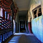
Paranoia
Letztes Wochenende erneut auf Ruinensafari mit
Commentaire
9


Information
| Section | Spezial: Schmerz und Leid |
| Vu de | 1 441 |
| Publiée | |
| Langue |

|
| Licence |
Copier la photo
Insère le lien suivant dans un commentaire, une description ou un message pour montrer cette image.
Copier le lien...
Clique, STP, sur le lien et utilise la combinaison de touches "Ctrl C" [Win] ou "Cmd C" le [Mac] autour du lien à copier.
Partager sur Messenger
Insérez le lien suivant dans le champ de commentaire de la conversation désirée dans Messenger en utilisant 'Coller' pour envoyer cette image dans le message.
Copier le lien...
Clique, STP, sur le lien et utilise la combinaison de touches "Ctrl C" [Win] ou "Cmd C" le [Mac] autour du lien à copier.
Manu Ka 06/10/2006 11:59
Sehr gut !LG
Manu
Barbara-J. 02/10/2006 17:28
Phu, irgendwie darf ich mir das Bild nicht länger ansehen, da wird mir ja irgendwie schwindelig bzw. mulmig zumute... ;-) Toll umgesetzt!LG, Babsi
JoelCartier 02/10/2006 12:18
geil, geil, geil...! wie bei meiner letzten zauberpilzsession :))greez joe
| Heike | 29/09/2006 19:09
Auf die Idee, das Gefühl "Paranoia" bildnerisch umzusetzen, bin ich auch noch nicht gekommen und ich kenne auch kein Bild, welches das Thema anfaßt.Diesen maroden Ort dafür zu wählen finde ich sehr passend. Ganz hinten das Gitter als Symbol der Eingesperrtheit, hingegen die linke offene Tür den freien Weg zum Licht aufzeigt.
Sehr durchdachte Umstzung dieses schwierigen Themas.
lg von Heike
Karin Vollert 27/09/2006 22:47
toll gemacht, aber die Farbkombination passt nicht für Paranoia. Hier wirkt der Farbe an sich Kontrast. (Farben 1. und 2. Ordnung ungetrübt). Dieser Kontrast erzeugt ein fröhliches und heiteres Gefühl. Zu Paranoia passt der Simultankontrast. Das wäre eine echte Herausforderung. Der ist aber nicht so einfach erklärt. Frag mich, wenns dich interessiert.lg Karin
Dieter Echterhoff 27/09/2006 14:48
Ich will hier rauuus!!!Gruß Dieter
ENIWA 26/09/2006 19:59
manche sehen so täglich...*lach*Tolle Arbeit...:-))
Lg, Ewa.
Daniel Bäcker 26/09/2006 18:12
lolDHZ 26/09/2006 17:05
so habe ich gesehen, als ich nach meinem letztenWies'n Besuch aufgewacht bin :-)))
BG Daniel