

Commentaire
12


Information
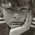
| Section | Menschen: Portrait |
| Vu de | 1 087 |
| Publiée | |
| Langue |

|
| Licence |
Copier la photo

Insère le lien suivant dans un commentaire, une description ou un message pour montrer cette image.
Copier le lien...
Clique, STP, sur le lien et utilise la combinaison de touches "Ctrl C" [Win] ou "Cmd C" le [Mac] autour du lien à copier.
Partager sur Messenger
Insérez le lien suivant dans le champ de commentaire de la conversation désirée dans Messenger en utilisant 'Coller' pour envoyer cette image dans le message.
Copier le lien...
Clique, STP, sur le lien et utilise la combinaison de touches "Ctrl C" [Win] ou "Cmd C" le [Mac] autour du lien à copier.
Norbert Gutscher 29/01/2004 16:08
schade.eigentlich möchte ich die wirkung eher erst auf den zweiten blick. ich arbeite dran. :-)
lg norbert
Stephan Wissmann 28/01/2004 22:26
@veniaminfinde deine anmerkungen etwas daneben.
hab mir mal deine fotos angeschaut..naja!
lg
stephan
Stephan Wissmann 28/01/2004 22:23
ein meisterwerk der portrait-fotografie.und dergibt dem ganzen noch den letzten kick.
klasse
lg
stephan
Norbert Gutscher 28/01/2004 17:20
Danke Markus. Auf diese Anmerkung wollte ich natürlich nicht verzichten. :-)LG Norbert
Der Markus Art-Light-Pics 28/01/2004 17:18
Hey Norbert,also ein zweiter Versuch....hatte geschrieben das ich das Portrait echt klasse finde. Die Grauwerte, Helligkeit, Schärfe des Model bzw. Unschärfe des Hintergrundes und Beschnitt passen einfach. Ebenso der Blick des Model und die Klamotten...echt, hat voll was!!! Sehr schöne Aufnahme!
LG
Markus ;-)
Norbert Gutscher 28/01/2004 12:46
Von der Sucht, hier Bilder zu präsentieren, die "gefallen" habe ich mich weitgehend befreit. Obgleich ich weiß, dass dieses Massenmedium denkbar ungeeignet dafür ist. Es ist zu schnell und flüchtig. Seltsam ist nur, dass gerade Veniamin ein gefälliges Bild erwartet. :-)Marijan G. 28/01/2004 11:59
Na, gut, Kappe ist dominant, keine Frage. Hat aber schöne Form. Auch Mantel ist gut durchgezeichnet (was mir hier sehr gefällt) und fängt der Blick. Und doch dazwischen ist ein Gesicht, das sich vor Kälte schützt und gleichzeitig mutig schaut. Mir gefällt es so. Vielleicht habe ich eine Vorliebe für visuelle Mehrdeutigkeit... auf jedem Fall ich sehe es so.Grüsse
Marijan
Norbert Gutscher 28/01/2004 11:31
Hmm, Veniamin. Vielleicht ist dieser Kontrast gerade das, was es aus macht. Klar. Für eine Kontaktanzeige ist es nicht besonders geeignet. :-)Elisabeth Hackmann 28/01/2004 9:01
wunderbare Strukturen u. Grautöne.. ich finds ein klasse Pic.. aber er guckt immer so grimmig..;o)LG elisabeth
Dirk Hofmann 28/01/2004 5:47
sehr gut!!!willi08 28/01/2004 1:28
Starkes Portrait.Gruß Wilhelm
Willi Maltzahn 28/01/2004 0:35
klasse, hier stimmt meiner Meinung nach alles.Ausschnitt, Tönung, Kontrast, Helligkeit.
Gruß
Willi