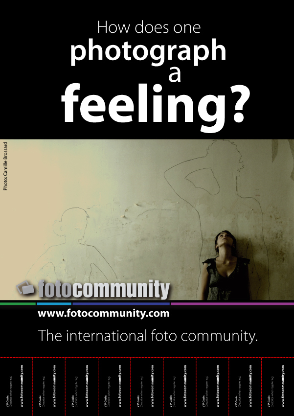
Poster - WE NEED YOUR HELP!
Hi guys!
we, the fotocommunity team, need your help! We want to hang this poster here to the pin boards of British universities in order to introduce fotocommunity to young and creative hobby photographers. Now we would like your feedback. Please write us your opinion about the poster and the slogan in a brief comment. Is it good enough? Do you have any better
ideas for a text?
many thanks and kind greetings from the fotocommunity team!


Armin Ates 14/11/2007 16:27
__________________________________________________________________________hi!
today we discussed all your input. your given feedback was very important to us.
we discussed a lot of pro´s and con´s - here is the final result:
final result
Armin Atesthere won´t be too much modifications as you can see, but the ones made are quite important.
slogan is changed, typo is changed (the a), international PHoto community spelled correctly.
btw, the french version of this poster, which looks quite similar, is distributed already and works out quite well.
THANK YOU SO MUCH!
armin
Kenny Jazz 13/11/2007 12:17
I wrote message in forum topic:)Andy Pomplun 13/11/2007 0:52
I would mostly agree with Michael's suggestion, "how do you photograph a feeling?" sounds very good after all, and yes, I think we could leave the www ..... ;)Maria Mylona 12/11/2007 20:07
I do agree with all previous comments. An idea about the place of the logo would be to put it on the upper right hand of the image? It would seem like she is "looking" at the "foto"community.. Well of course then the sketch on the wall would not be totally seen. But in where the logo is know is not the best place. Just move it a bit around. Just my thought!Good luck.Maria
KasiaDesign 10/11/2007 9:49
I like it very much but agree with Peter.Gau.In English it sounds very stiff and formal to use the "one" form. Having gone through a few formulations I think I'd react best to the following if I saw this emotive poster:
"How would
you
capture a feeling?"
Graphically, the uncentered "a" in the title looks a little weird unless there is another uncentered text to make it look like a deliberate move.
I also would take the fc logo out of the shot. It is a really simple, emotive work and the logo clutters it, especially as the next line contains the URL anyway:
I would move the logo down to the next section with a hidden link to the URL and center it just like the following text. The link is featured anyway many times in the sections at the bottom.
Looking forward to seeing the final poster. Good luck.
Kathryn
dargel-photopictures 09/11/2007 18:04
Halloklasse Arbeit sieht gut aus ,hast du super Dargestellt !Gibt Gold !
lg CD
Peter. Gau 09/11/2007 15:49
the photo is great!!regarding the text i would write:
"How would you photograph feelings?"
I also would loose the text (fotocommunity) in the picture, leave the e mail adress and write then: The international photo community. Change f into ph.
Detlef Klahm 08/11/2007 5:50
the simplicity of this image makes a direct statement to the art!...Wonderful Job !