

Rot
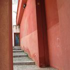
Ein Hinterhof in Cefalu, Sizilien
Commentaire
4


Information
| Section | Motive: Profanbauten |
| Vu de | 940 |
| Publiée | |
| Langue |

|
| Licence |
Copier la photo
Insère le lien suivant dans un commentaire, une description ou un message pour montrer cette image.
Copier le lien...
Clique, STP, sur le lien et utilise la combinaison de touches "Ctrl C" [Win] ou "Cmd C" le [Mac] autour du lien à copier.
Partager sur Messenger
Insérez le lien suivant dans le champ de commentaire de la conversation désirée dans Messenger en utilisant 'Coller' pour envoyer cette image dans le message.
Copier le lien...
Clique, STP, sur le lien et utilise la combinaison de touches "Ctrl C" [Win] ou "Cmd C" le [Mac] autour du lien à copier.
Mathias Blanck 15/06/2005 22:47
Eine interessante Perspektive hast Du da gewählt. Vielleicht wäre ich sogar noch etwas tiefer gegangen, um die vordere Stufe besser zu Geltung kommen zu lassen.Etwas knalligere Farben würden dem Bild besser stehen.
Bin ja gespannt auf die anderen Urlaubsbilder !
Viele Grüsse
Mathias
Judith Wachsmann 09/06/2005 9:26
Hi Kirsten,ich würde unten noch minimal schneiden,
so dass der graue Streifen verschwindet ...
lg,
Jule
Oliver Erlewein 04/06/2005 2:35
Nett gesehen. Ist einfach und doch schoen.Ulrich Rüth 03/06/2005 22:28
Es wundert mich, dass ich hier den ersten Kommentar schreibe, denn die Perspektive hat was!Gruß
Ulrich