

Commentaire
13


Information
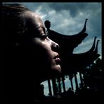
| Section | Motive: Archiv - Kritik am Bild |
| Vu de | 951 |
| Publiée | |
| Langue |

|
| Licence |
Copier la photo

Insère le lien suivant dans un commentaire, une description ou un message pour montrer cette image.
Copier le lien...
Clique, STP, sur le lien et utilise la combinaison de touches "Ctrl C" [Win] ou "Cmd C" le [Mac] autour du lien à copier.
Partager sur Messenger
Insérez le lien suivant dans le champ de commentaire de la conversation désirée dans Messenger en utilisant 'Coller' pour envoyer cette image dans le message.
Copier le lien...
Clique, STP, sur le lien et utilise la combinaison de touches "Ctrl C" [Win] ou "Cmd C" le [Mac] autour du lien à copier.
Helmut Gillitzer-Felber 29/01/2007 14:41
sehr schöner ruhender Ausdruck mit Wachsamkeit..LG Helmut
Up In Smoke 27/09/2006 16:10
einfach klasse!!!! sehr schön-Eos- 25/08/2006 11:54
wau!!!Bernd Beisel 24/08/2006 22:50
Finde die helle linke Gesichtshälfte ok, nur der helle Fleck auf der Stirn stört mich auch.Bye, BERND
Holger W Stief 24/08/2006 17:29
Auch mir ist die linke Gesichtshälfte zu hell und der Fleck auf der Stirn stört wirklich.Ansonsten: Eins der wenigen Protraits die mir gefallen.
Viele Grüße
Holger (der weiß was 6x6 bedeutet)
Ist das vom Negativ / Dia eingescannt?
Vassilis K. 24/08/2006 13:26
@Thomas N.Ich bin froh zu wissen was slr bedeutet :-)
Lady Bathory 24/08/2006 12:03
ist die frau 36?? oder ist es 36 facher Sexappeal..?? naja sehr schöne Perspektive jedoch ist es mir zu überbelichtetStefan R. Bürger 24/08/2006 10:58
wirklich schönes Fotodie Überstrahlung passt hier irgendwie zum Motiv und wurde passend eingesetzt. Ein strahlendes Lächeln. ;)
lg stefan
NO BUDDY 24/08/2006 10:28
schön inszeniert aber leider völlig überstrahlt die rechte seite.am auge sind ja kaum noch konturen zu sehn.schade.grüsse
Markus Luigs 24/08/2006 10:16
Schönes Portrait. Der weiße Fleck auf der Stirn irritiert. Auf der linken Gesichtshälfte sind die Lichter komplett ausgefressen.Thomas Niedermüller 24/08/2006 8:33
danke schön@vassilis: 6x6 ist die größe des formates der hasselblatt, da mittelformat aber nicht viele kennen, habe ich gleich das ergenbniss mit hingeschrieben.... ;-)
jörg Z.. 24/08/2006 7:24
etwas zu viel an Kontrast und der Hintergrund etwas zu lebhaft, aber vielleicht war das ja so gewollt, auf jeden Fall ein Blickfang!gruß Jörg
Vassilis K. 24/08/2006 7:24
Klasse Augen, schöner Mund!!!BK
(Den Titel versteh ich nicht, macht aber nix)