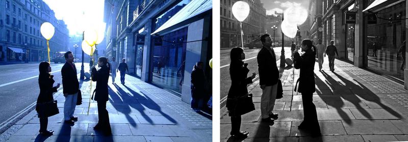
Balloons and shadows times deux!?
I was commissioned to take photographs of a Godiva Chocolates promotion in London's Regent Street yesterday and will post a slideshow of this fun event later today. However, one picture I took just before it really got started had some wonderful light and a graphic quality that I really liked. It reminded me of an iconic picture by Rene Burri taken of three men on a Sao Paolo office building rooftop. The picture above is how it came out of the camera, shot in jpeg mode as the client wanted to have pictures available immediately. As you see the highlights are blown but there is lots of lovely detail elsewhere.
I decided to try and recreate what I actually saw and copied some balloons, more properly exposed from another picture I took a few moments later just to the right of the scene, then added some sky and clouds from yet another picture. Then I converted it to B&W which it seemed to ask for.
I like the end result, but I also like the original - what do you think? Is the final version, better or worse, if worse why?, if better - why? If you had changed the original how would you have done it?


Sarah D. Kiefer 03/02/2007 6:35
overall, very compelling with a nice story. the b&w image handles the sun better than the color. on the other hand, it's balanced by the darker forms of the woman's feet and her shadow. i like the triplet shadows and the window reflections. good work!sarah k
Inez Correia Marques 29/01/2007 23:34
Wow.. the b&W is just perfect....good stuff.
the first one is not worse at all.. i just think the B&W has more strenght.. hummm and i love black an White.
Classic
Daren Borzynski 29/01/2007 18:40
Really like the B&W version... the crop is much better.Great work on the sky!!
Cheers!!
Daren
Sissi Blume 28/01/2007 19:03
A great Duett.I like both!