

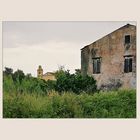
die Kirche von Lefkimmi
Farbversion.
Commentaire
14


Information
| Sections | Spezial: 5 - Freitag nach Marodistan Motive: Profanbauten Voyage: Corfu |
| Vu de | 5 761 |
| Publiée | |
| Langue |

|
| Licence |
Exif
| APN | NIKON D750 |
| Objectif | --- |
| Ouverture | 13 |
| Temps de pose | 1/200 |
| Focale | 85.0 mm |
| ISO | 160 |
Plébiscité par


Copier la photo
Insère le lien suivant dans un commentaire, une description ou un message pour montrer cette image.
Copier le lien...
Clique, STP, sur le lien et utilise la combinaison de touches "Ctrl C" [Win] ou "Cmd C" le [Mac] autour du lien à copier.
Partager sur Messenger
Insérez le lien suivant dans le champ de commentaire de la conversation désirée dans Messenger en utilisant 'Coller' pour envoyer cette image dans le message.
Copier le lien...
Clique, STP, sur le lien et utilise la combinaison de touches "Ctrl C" [Win] ou "Cmd C" le [Mac] autour du lien à copier.
LouisaZ 27/04/2024 10:08
In Farbe sieht das nicht gar so marode aus; na ja eigentlich doch. ;-))Herzlichst grüßt dich Sigrid
Veronika Müller 27/04/2024 6:32
Wirkt fast flächig, ohne Tiefe mit dem hellen Himmel,feine Aufnahme!
Gruß, Veronika
berutti 26/04/2024 18:06
Ganz wunderbar !Bodo.K 26/04/2024 16:34
In SW noch eindrucksvollerZerwonke 26/04/2024 15:31
Die Dornen wirken nicht ganz so dicht und die Kirche weniger verloren.Gr au B
Monsieur M 26/04/2024 15:22
Diese Version ist ebenso sehenswert, wie die SW-Variante. Aber SW gefällt mir hier doch noch etwas besser.LG Norbert
Gerd Ka. 26/04/2024 14:56
Spannend inszeniert! Das Hauptmotiv klein im Hintergrund zu platzieren muss man sich erstmal trauen. Dir ist es gut gelungen.Viele Grüße
Gerd
kristofor 26/04/2024 13:53
Ja, da würde es mir auch gefallen!Clau.Dia´s 26/04/2024 13:17
Stimmungsvoll, und das Bild erzeugt Fernweh bei mir.André Reinders 26/04/2024 12:53
Sehr toll im Aufbau und SchnittLG
André
Marion Stevens 26/04/2024 12:02
Da ich ein Farbfan bin, gefällt mir die farbige Version doch besser, weil eindeutig "lebendiger", aber beide haben ihre Berechtigung.Viele Grüße
Marion
Astrid.KF 26/04/2024 11:23
Ich muss gerade wirklich überlegen ;-) , denke dass deine S/W Präsentation den Verfall zwischen den genutzten und nicht genutzten Gebäuden besser spiegelt. Aber auch in Farbe eine interessante Wirkung , vor allem aus dieser Perspektive. VG AstridMartina Thewes 26/04/2024 11:02
Sieht sehr gut aus.LG Martina
Maifeldblende 26/04/2024 10:47
s/w ist mein Favorit ;)