
drops
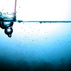
experiment mit wasser
Commentaire
9


Information
| Section | Motive: Archiv - Kritik am Bild |
| Vu de | 1 244 |
| Publiée | |
| Langue |

|
| Licence |
Copier la photo
Insère le lien suivant dans un commentaire, une description ou un message pour montrer cette image.
Copier le lien...
Clique, STP, sur le lien et utilise la combinaison de touches "Ctrl C" [Win] ou "Cmd C" le [Mac] autour du lien à copier.
Partager sur Messenger
Insérez le lien suivant dans le champ de commentaire de la conversation désirée dans Messenger en utilisant 'Coller' pour envoyer cette image dans le message.
Copier le lien...
Clique, STP, sur le lien et utilise la combinaison de touches "Ctrl C" [Win] ou "Cmd C" le [Mac] autour du lien à copier.
Bernhard Gruber - Photography 16/05/2011 12:39
Wunderbare Aufnahme eines eintauchenden Tropfens. Guter Farbverlauf und super Schärfe.lg bounty390
Simon Steinberg 29/09/2007 13:25
Schöne idee schönes Bild mehr davon bitteChristoph Büdenbender 29/09/2007 12:49
Yep, Kracher !! Rück´s noch gerade, dann isses ein Klasse Schuss !!zebranski 29/09/2007 10:47
@essel hehe ja den meinte ich ;-))Alex-R 29/09/2007 9:26
find ich auch eine gute Idee. Könnte nach unten noch etwas dunkler werden.Sascha Hübers 28/09/2007 22:56
und die wasseroberfläche sollte gerade dann, das wäre schönerEssel 28/09/2007 22:02
Da ist im ganzen Bild kein Strohhalm zu sehen ;)) Wenn Du den Trinkhalm meinst ... den finde ich als Kontrast richtig klasse ... auch wenn rosarot nicht so ganz meine Farbe ist ;))Gruß
Stefan
zebranski 28/09/2007 21:55
hat was und gefaällt mir irgendwie. wobei ich mich jedoch ein bisschen am rosarot des strohhalmess störe. hätte blau oder grün beforzugt.gruss
Essel 28/09/2007 21:46
Mir gefällt es. Klasse Idee und Umsetzung. Die Farben sind auch toll.Gruß
Stefan