
Commentaire
11


Information
| Section | Menschen: erwachsene Menschen |
| Vu de | 1 901 |
| Publiée | |
| Langue |

|
| Licence |
Copier la photo
Insère le lien suivant dans un commentaire, une description ou un message pour montrer cette image.
Copier le lien...
Clique, STP, sur le lien et utilise la combinaison de touches "Ctrl C" [Win] ou "Cmd C" le [Mac] autour du lien à copier.
Partager sur Messenger
Insérez le lien suivant dans le champ de commentaire de la conversation désirée dans Messenger en utilisant 'Coller' pour envoyer cette image dans le message.
Copier le lien...
Clique, STP, sur le lien et utilise la combinaison de touches "Ctrl C" [Win] ou "Cmd C" le [Mac] autour du lien à copier.
Kl. Brown 24/08/2005 11:12
@ Xaverius X.: Der Titel ist Super!!!!!!!!!!!Xaverius X. 24/08/2005 10:12
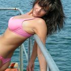
Was hat denn der Titel mit dem Bild zu tun?Da wurde die "Standard-Aufmachung" einer Frau in der Fotocommunity (minimal bekleidet, das aber maximal posiert...) über ein Geländer gehängt, damit sich die Oberweite durch die Thoraxdurchbiegung noch besser in Szene setzt.
Die gespannte Haut im Bereich der Achselhöhle zeigt gut die Bequemlichkeit dieser Haltung..........
Vom Kieswerk kann ich da nichts erkennen.
Der Titel könnte besser heissen:
"Model übers Industriegeländer gehängt" (IMHO)
Kl. Brown 24/08/2005 9:36
@ M.Schwaar, Kunst ?Andreas Hurni 24/08/2005 8:57
polarisieren?ne, das tut es nicht - da fehlt doch einiges.
Johannes Faber 24/08/2005 8:47
Danke die M.Schwaar.Ps.an dem bild ist nur bischen die schärfe angehoben,
und nicht geschnitten,wie gesagt schappschuß.
Andreas Hurni 24/08/2005 8:39
ist ja auch nicht falsch, nur vielleicht nicht ganz optimal - links unten kommt zuviel zu knapp rein. anschneiden ist nicht grundsätzlich pfui, im gegenteil, der anschnitt hier ist jedoch zu detailgeladen.querformat, denk ich mir, hätte hier bessere kompositionen ergeben
Kl. Brown 24/08/2005 8:38
Normen hin und her, das rote Bodenblech stört und lenkt ab.Freundliche Grüsse aus dem Süden von k.b.
P.S. Anfänger und dann gleich Modelagentur u. solche Bilder ;-) ???
Johannes Faber 24/08/2005 8:35
war ja auch mehr oder weniger ein schnappschuß,aber mir gefällt es.ich fange ja auch gerade erst an mit der Fotografi,Andreas Hurni 24/08/2005 8:32
versuchen kann man alles, mit norm hat das nichts zu tun.Johannes Faber 24/08/2005 8:31
Muß es den immer der Norm entsprechen, man kann es doch auch mal anders versuchen.-) OderAndreas Hurni 24/08/2005 8:24
der schnitt scheint mir eigenartig ...