Security (revisited)
Occasionally, when I have some down time between shoots or a lack of fresh material to work on, I go back to my older pieces and address some editing issues that might have been done better or even find a way to improve on the initial idea completely.
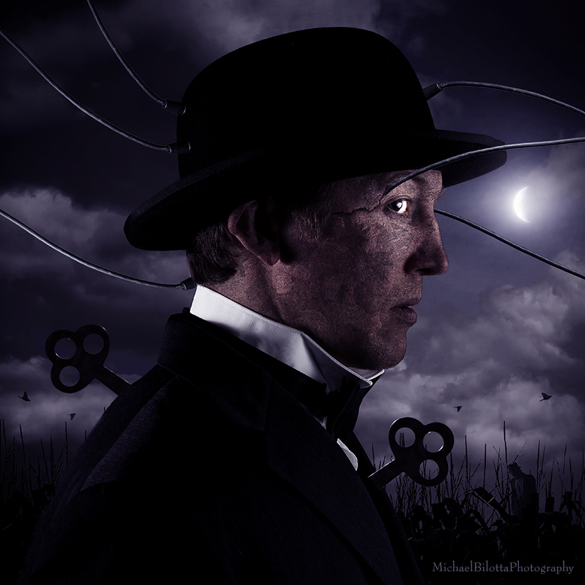
One of those pieces is this one, from early last year, called "Security." This one had a few problems to correct on the technical end - things like masking issues, blends, but also there was something else that bothered me I wanted to address - namely, the fire in the original. I recently wrote a blog talking about my position on using stock images and over time, I have come to avoid that - preferring that all elements of the piece be shot by me. This fire was certainly not shot by me, as I would have had to light quite a big one to get it. I think the original sky wasn't mine either. Given that two fairly large components of the piece were not my images, I wanted to address those, but also, looking at it one year later, I didn't see a compelling reason for the fire in the first place.
This image is about fear, vigilance, paranoia even, the watchful mind seeing shadows in the corner of his mind, poised for invasion or worse. This piece was a reaction to a break in attempt of my home last year, and what it did to me psychologically - how the need for security and safety can become a prison in itself, where peace of mind is replaced by fear of a random element or threat. What then did that have to do with fire? Well, the fire certainly had a point - another threat to home and safety, but I find this to be a distracting element to the image now - way too much attention drawn away from the central character and his state of mind. The same goes for the two small figures seen to the right: there was a point for them being there, but again, too much information in too small a space. They feel peripheral and distracting to me now, one year later. Lastly, I felt the color and overall brightness of the original hardly said threat or night - a little too bright and warm for the intent.
With all that in mind, I decided to clean this one up. Gone are the fires and the two smaller figures, and this person is more clearly in the night now - still watchful and paranoid, still plugged in to the security systems which are both literal and metaphorical. I decided to place a very small stranger into the cornfield, a silhouette, a shadow that could be a man. I found this to be much more organic to the idea, and a lot more subtle.
Here is the link to the original version:
https://www.flickr.com/photos/shibbopics/8519623279/
A Before and After version of this image will be available on my Facebook page and my website, showing the original two versions as well as this updated one, side by side.
www.facebook.com/MichaelBilottaPhotography
www.michaelbilotta.com
model: Zack Barnes


AnitaJdS 21/07/2014 23:04
que chevere!